Intranet design best practice: 12 tips to drive engagement

Your intranet design should as unique as your organization and the people in it. However, to ensure you’re wow-ing your users and meeting your organization’s objectives, there are some simple intranet design best practices you need to be following.
There is no silver bullet when it comes to intranet design.
This is something we’ve come to understand from our years partnering organizations around the globe: there’s no definitive, absolute, ‘this is it!’ eureka moment. We can’t point to one single intranet, homepage, or even part thereof and say, ‘that’s the perfect design’. There is no such thing.
The trouble is, design can be… complicated.

Intranet Design Guide
There are so many elements included, so many things influencing it. It’s also highly subjective and what’s ‘good’ for one organization can easily be considered ‘bad’ for another.
I love Sony Interactive Entertainment’s intranet design, for example; but could you pick it up, switch around some colors, slap on a fresh logo and insert it into a healthcare organization? A bank services provider? Probably not.
But while it can be hard to define the “perfect intranet design”, it’s much easier to pick out the bad apples. Thanks to our experiences as consumers and the continuing focus on UX, and intranet UX, we can almost instinctively tell when an external internet site isn’t up to par; the same general rules apply to an intranet.
So, while we can’t give the absolute ‘must-do’s’, there are definitely some intranet design best practices that can mean the difference between loved, useful, engaging…and digital wasteland.
#1. Be selective with your content
If you want your intranet to be the company go-to, the single source of knowledge, the central hub for all your information, surely this means everything needs to go on there?
Well, not exactly. Content is the foundation of every intranet and this can be a tricky line to navigate. However, just because it exists, doesn’t mean it has to go on the intranet.
Being selective with what you choose to put on your intranet is a crucial part of the design process; a carefully considered information architecture ensures that your intranet is useful, usable, and used. Failure to take this step will turn your intranet into a document dumping ground.
Conduct a content audit, trim out the duplicates, evaluate what actually gets used and read. If you’re connecting with SharePoint or your company document management system, consider which folders are company-wide and need to be indexed – and which have niche information only required by small groups. Leave those off the list.
We scaled down from the 5,000 pages on our old intranet ‘StaffZone’, to just 1,200 pages on Flo, our new Interact intranet. It was a huge amount of work rewriting and consolidating the content, but it’s been well worth it in terms of navigability and user experience.
– Andy Crouch, Kent Community Health NHS Foundation Trust
This can reduce the time taken to find content or information, improve site speed, enhance the user experience, and streamline and simplify the overall design.
#2. Treat your homepage as prime real estate
There can be a temptation to overload intranet homepages: it’s a valuable piece of digital real estate, so it stands to reason that there’s a pressure to make the most of every inch.
The trouble is, this can translate into an overcrowded, busy, and disengaging pages no-one reads. One of the toughest jobs for anyone taking responsibility for intranet design ideas is that of gatekeeper, or ‘doorman’: you have to be able to say ‘no’.
Be precious with the space and question the value of the content or widgets you choose to put there. Check each against your intranet objectives and evaluate their usage on a regular basis.
What’s important to your organization? What areas of your intranet are the most visited, used, read? What are your intranet objectives, and what features or content support those? Ask these questions for every piece of content you’re applying to the homepage.
Intranet Design Guide
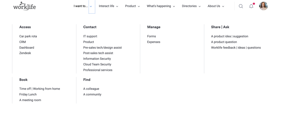
#3. Don’t overload the navigation
Similar to the homepage, there can be a tendency to pile every possible link or area into your navigation.
Depending on the functionality of your intranet, this can result in epic drop-down navigation menus that dominate the full length of the users’ screen, or perhaps two-line or more navigation toolbars. It’s messy, overpowering and difficult for users to find what they need.
When it comes to designing your navigation, go for logical grouping of content and consider what areas of your intranet warrant a place at the top. For example, does every team or community need listing in the menu? Or do you group them together in ‘Communities’, and direct users to a page listing?
As a general intranet design best practice rule, keep the top nav to between 4 – 7 options if you can; definitely don’t slip into a two-line top menu. Give your users credit; if they’re looking for something, they’ll be willing to dig around a little, or use the search function.
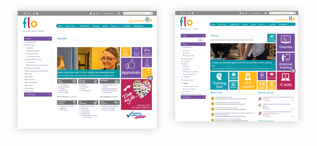
If you have Mega Menu functionality in your intranet, this may be a more user-friendly approach when you have lots of links; an approach we took to the re-design of our own intranet recently:
(a Mega Menu enabled us to feature the most-visited areas in logical groups, with formatting such as typography and columns separating out the different areas clearly.)
A mega menu isn’t always appropriate, however; this great blog from Envato discusses the pros and cons from a website perspective, but much of the same applies to best intranet platform design practices.
#4. Prioritize accessibility
Your intranet should be a company-wide tool, used by everyone who wants and needs it. Accessibility is a top-ranking concern for any website developer; it’s a focus that needs picking up internally also.
From an intranet design best practice perspective, this means factoring in things like color blindness, for example; ensuring you have contrast between foreground and background to make your content pop; the readability of your typography size or font choices, use of captions or alt text for imagery, and more.
The Web Content Accessibility Guidelines (WCAG) set out the basic requirements.
Intranet Design Guide
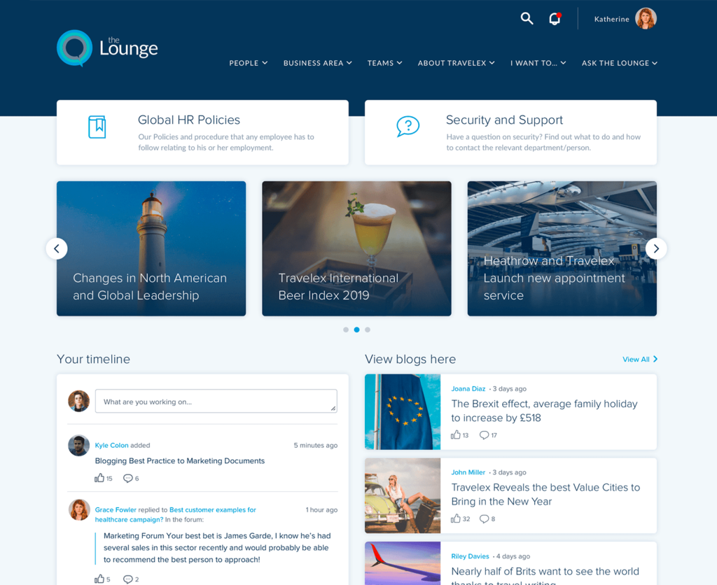
#5. Add dynamic content
There’s a reason social media is so addictive: it continually serves us up with fresh, real-time updates.
Dynamic content is an important part of intranet design because it provides users with a reason to keep coming back.
When designing your homepage, in particular, ensure you’re including widgets that will continually pull in new content such as a newsfeed, or high-volume content areas such as company news or blogs, depending on your organization.
#6. Make it mobile-first
It’s the mantra of the moment for a reason. Although we’re increasingly aware of the importance of optimizing technology for mobile for our customers and consumers, we’re still lagging on the uptake when it comes to our internal tech.
Our own Interact data analysis shows a steady increase in the number of users accessing their intranets from a mobile device and outside of core working hours. It’s a trend that shows no signs of slowing.
Native intranet apps take much of the headache out of mobile-first design, because they resize and pull through information in a consumable format for mobile devices. If your intranet is only available as a mobile version of the full site, ensure you’re testing your intranet performance across devices and embedding responsive features that will view correctly.
#7. Apply your internal brand – consistently
Like any external-facing website, designing and applying a brand and theme throughout your intranet is one of the most powerful design tools at your disposal. Don’t just stop at the homepage.
Intranet design best practice from this perspective dictates that you keep some consistent elements throughout your intranet: even in the face of different departments, communities, or content areas.
This may be, for example, carrying your logo and intranet layout throughout each content area, but changing the primary color depending on the department; or perhaps retaining the same color palette and typography, while giving freedom and flexibility on the layout.
Intranet Design Guide
#8. Use templates
One of the simpler best practices for intranet design is to create and use templates for your content authors and contributors.
For example, if they’re going to be regularly contributing news stories on your intranet, a basic template that uses the same heading format, reminds them to input an image, includes a summary and defines what the subheading size is will provide consistency.
Adopting this simple intranet design best practice tip will help your intranet look and feel tidier, enhancing the overall design and engagement among users.
#9. Prioritize: use a hierarchal approach
Not all information and content are created equal.
We instinctively respond to hierarchies around us all the time, understanding that those elements around us that are bigger, first, higher, brighter, unique, a different color, etc., are more prominent and, therefore, likely to be more important or worthy of our attention.
It’s a tactic used in marketing and advertising all the time, and when applied to your intranet design, can ensure you’re meeting those all-important objectives by grabbing and retaining the attention of your users where it counts.
In practical terms, intranet design best practice calls for things like using headings, sub-headings, and standard text; putting the most important information ‘above the fold’ at the top of your pages; and using contrast, color or images to draw attention to important content.
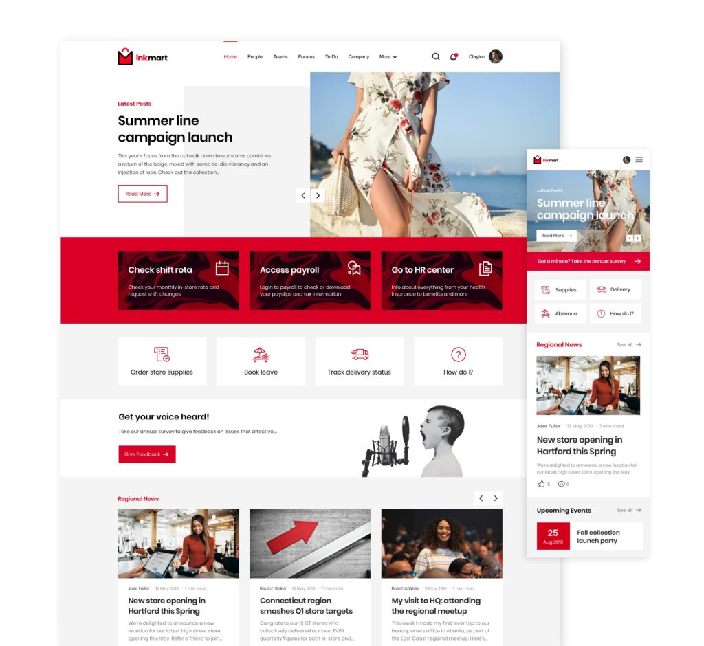
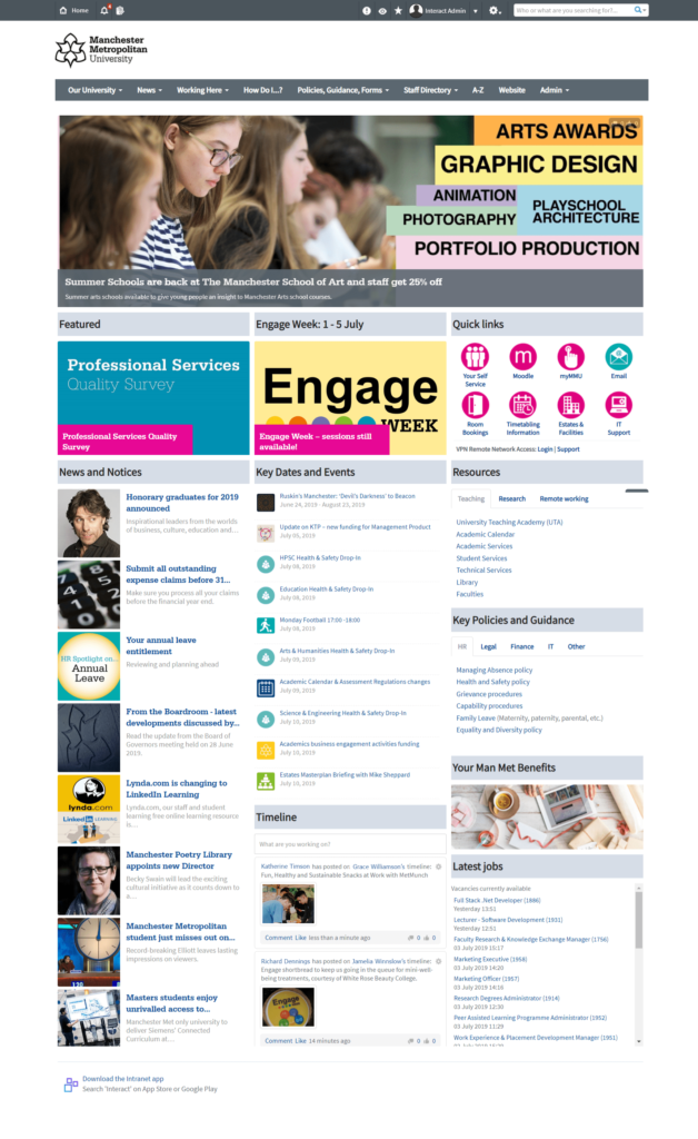
In Manchester Metropolitan University’s intranet homepage, we can see this concept presented simply through the use of the full-width hero banner (most important) followed by three image-based modules (next most important) and then small text (least important).
#10. Don’t be afraid of white space
White space is often seen by website and intranet owners as ‘empty space’ and, therefore, a waste of space. It is, in fact, a powerful and essential design element. Ask any UX designer.
As well as providing visual breathing room for your user, white space – or ‘negative space’ – makes your content more legible, helps draw attention to specific areas on a page, helps separate areas from one another, ensures your intranet looks cleaner and tidier, and generally helps with the balance and flow of a page.
Consider the difference between the following examples:
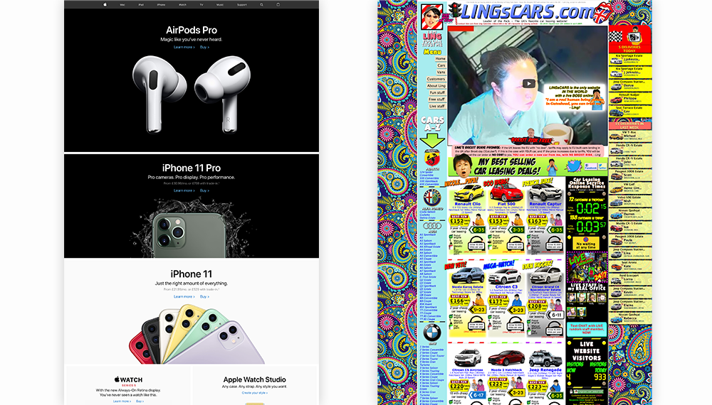
Resist the compulsion to fill every available inch and ensure you’re factoring in padding, margins, space between widgets and more. This draws the user’s attention to what’s important, retains their attention, and naturally draws the eye down the page.
Intranet Design Guide
#11. Use balance, alignment, proportion, and symmetry
The design of any web or intranet page should draw the eye along and down the page in a natural flow, making it easily consumed and scan-able.
The principles of balance and symmetry are prominent in all forms of art, photography, architecture, and for good reason. We may not necessarily look at a building and mentally note to ourselves, “that’s well-balanced and symmetrical!”; but if it isn’t, we’ll almost instinctively feel uncomfortable. It jars, grates, it feels innately wrong.
When it comes to intranet design best practice, we need to follow the same idea: ensuring the different elements and widgets are balanced, aligned, of a similar size and visual ‘weight’, and positioned in a symmetrical manner. Consider the difference in layout between the two options below:

We may have been championing the use of white space in our previous point; but in the example on the left, you’ll see widgets are of different lengths and sizes, don’t line up, and there are ‘gaps’ which feel as though there are parts of the design that are broken.
Consider how we move down and through a page; if the users’ eye is needing to hop or jump about, it’s a bad design.
#12. Mix it up: let images or video do the talking
In today’s visually-driven digital age, we now recognize and understand the value of images, video, graphics, and iconography. One of the most basic yet fundamental intranet design best practice tips is to mix up the media to create an engaging experience for your users.
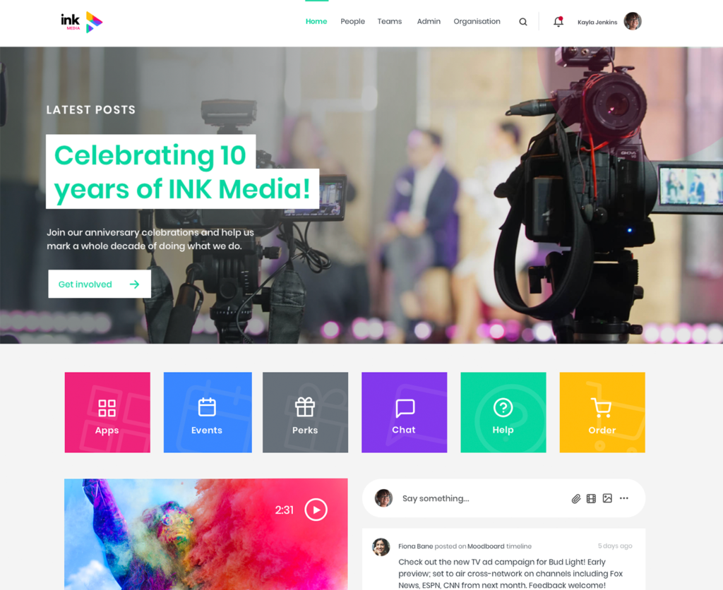
This may mean, for example, swapping out text links or shortcuts for visual icons; ensuring your content widget layouts on your intranet homepages balance images and text, or simply assigning replacement default images in your media library to eliminate the good ol’ ‘missing’ image.
The ratio of visuals to text may vary depending on your industry and culture; however, there’s no excuse for all-text intranet pages. They’re the fastest route to an unused intranet.
Intranet design best practice is a combination of art and science
If you’re not a website developer or a graphic designer, sometimes, the concept of design can feel overwhelming.
However, you don’t need to have a college degree in either subject to create compelling, beautiful, engaging intranet designs that will wow your users.
With the support of an intranet partner who understands your organization and vision and can offer easy to use drag-and-drop functionality to create your own homepage layouts, you’re already half-way there. Looking to consumer-facing websites for inspiration and understanding of what works well is also a great starting point.
Some of it can come down to instinct: we can understand when something isn’t right. Other aspects – such as accessibility – are more scientific and methodical. It takes a considered approach to both to nail intranet design; but it is achievable.
However, design is also organic, continuously evolving and changing. Once you have an intranet design in place, that doesn’t mean you’re stuck with it forever. Get feedback from your users, use trial and error, revisit your objectives and intranet performance metrics regularly to see what’s working and where you might be able to improve.
Despite the resource and time involved, intranet design is something worth investing in to get right: because it can mean the difference between adoption, and abandonment.