Embarrassing Intranet Homepages – it doesn’t have to be that way
Homepage health check
There is more to making a homepage vital than it just looking nice. While it has to be engaging, it also needs to be relevant and deliver what a user needs. Homepages are important as they are the first impression that a user will get of the intranet they are about to use.
However the first impression will soon pass and a user will judge the homepage on how useful it is for them. Does it present them with the information they need? Does it offer them clear routes to the functionality they need, or the tasks they wish to complete? These considerations apply both to the intranet homepage as well as the landing pages of the sub-sections of the intranet.
Here are some things to consider about your intranet, is it delivering what is expected of it – or are your homepages obstacles that a user needs to overcome and click past?
Let’s start with some of the ailments which a homepage may have
1. Welcome messages
Does your intranet suffer from very obvious & dominant welcome messages?
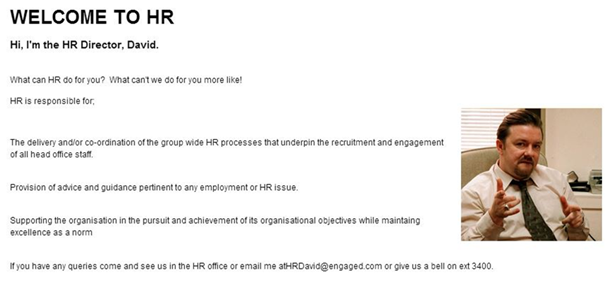
This is a fictitious HR director who some may recognise. I appreciate that what this well-meaning HR director wants on their part of the intranet is a warm and friendly welcome message which explains what the HR section is all about, or what the user can get from the HR section.
But, who does this benefit? Is it the end user? If the answer is no, then there needs to be some push back. Instead of taking up valuable space with a “vanity piece” it should instead be used to promote a recent policy update, important communication, or links to frequently completed tasks. It is also likely that as such widgets require manual intervention to update them the information contained is likely to be static and long lived, so quickly loses its impact and consequently soon becomes irrelevant.
Action 1. Search your intranet for any unknown free text welcome messages
2. Is your intranet homepage too busy?
If it is too busy then users will struggle to understand it, and its purpose. They will question what they need or what they could be doing in this area.
Ask yourself if it is laid out to meet user’s expectations? This is a key thing to consider. Does the name and the labeling chosen for the area reflect the actual content when you link through? For example if you have a “Forms” section on the homepage is the user quickly routed through to the form that they need? You can also make this time sensitive; as the end of the month approaches you could add a quick link through to the expenses claim form, which is then replaced by something else for the first three weeks in the month when claims aren’t going to be made.
Action 2. Look at your homepage in terms of assessing if its user focused
3. Is your homepage one which requires scrolling?
I’m not going to state that scrolling is good or bad. The question should be – if a user scrolls is it to their benefit? As we have evolved as web users we have become comfortable with scrolling. However we shouldn’t be scrolling down to something useful, because something less useful was positioned higher up the page. More and more of us are familiar with content extending below the bottom of the screen, and we will happy to scroll. But don’t take liberties and expect users to scroll down a long way, and certainly not to have to scroll down to something which you consider to be important.
Set out your homepage so that it shows the important content and shortcuts without scrolling. Some will feature short cuts to functionality; there is no harm in having these below the ‘fold’ if they are consistent and your user knows that they are always there. You don’t want things changing too much, there is a fine balance, but I will come to that later.
Action 3: Review the depths of the page.
4. How many areas of your intranet are unloved?
Where is the dust and cobwebs on your intranet? You may have many areas which are not used, like the electronic equivalent of a dusty book shelf. The more content areas you have, then the more homepages you will have and the greater likelihood that you have unvisited areas on your intranet. So this might not be just a homepage issue but also a structural issue. They long forgotten homepage may have been fit for purpose in the past and have become redundant over time
Action 4: Look at the unused areas of your intranet and either revive or delete.
5. The ever changing homepage
Change is good, there should be something new and fresh each time a user visits, especially on the main intranet homepage. But it shouldn’t change too much or have too much of it changing too often. As users of an intranet we appreciate consistency and continuity as much as we do the stimulation which change brings.
Action 5: Consider what you should be changing on your intranet and what should remain consistent
6. How does the homepage help people do what they need to do?
Intranet Manager Geoff Garcia from March of Dimes believes that having these 4 elements of a home page supports users in getting work done.
a.What’s happening
News, company announcements or events calendar
b.What’s trending
What popular in terms of feedback, what are people talking about on forums etc
c.Something fresh
This could be a blog, not necessarily from the chief executive or the management team, but something from a colleague which gives an insight into their daily responsibilities
d.Something fun
Something as simple as a poll or a gallery, maybe some content which is purposefully non-business. It might be the fun element which draws a user in and gets them to come to the intranet. When they get to the intranet they will then have the opportunity to see the corporate messages you wish to publicise.
Action 6: Look at how you could integrate each of these elements into your intranet
7. Customisation
In terms of the intranet homepage itself, you might want to consider customisation. These pictures below are not of an intranet but the Guardian website homepage on the day Prince George was born. The structure has stayed the same but the content of the homepage is different. This reflects that many who are interested in what is happening with the Royals would be very interested in the news an on the other hand on the same day you could switch to an alternative news story if not so interested.
The same thing can be achieved on an intranet homepage, the template or structure can be the same but with some alternative content for different audience groups, this could be based on job role or geographical location for example.
Action 7: Could you make 20% of your main intranet homepage unique to specific groups of users?
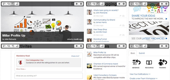
Toolbar
With Interact Intranet 7 there is a tool bar which offers content unique to each user, on the left of the screenshot below represented by a bell icon, is the notification, where the user receives alerts about the notifications unique to them.
Further along the tool bar is the eye icon which will notify users of any changes or updates to content which they have selected to watch.
Finally the star icon shows content that users have chosen as favourites, which may include content they use on a regular basis to help them in their role, or content which is of interest to them. This gives access to a drop down list of quick links to help users easily navigate to their frequently used content. This means you don’t need to add a widget for individually tailored dynamic content. It is already there in the structure.

Drag and drop
Home pages can also be facilitated by the drag and drop function as part of the new responsive design so it’s far easier for you to make a widget size narrower or wider, if you want to move something around you just hold your mouse but down and slide it to where you want it to go.