The AEIOU of an awesome intranet homepage
At Interaction 2014 I facilitated an energetic workshop in which we discussed the characteristics of a homepage that had the “Wow” factor not an “ow” factor. While many of us are aware what makes up a positively received homepage I wanted to have some fun and see if we could come up with some agreement on what the characteristics could be, using adjectives that started with A, E, I, O and U.
I did have some thoughts of my own on what the chosen adjectives could be that there was some surprises that emerged too.
‘A’ stars
The top 3 adjectives for A were;
- Attractive
- Accessible
- Amazing
Clearly there are some adjectives that have very similar meanings, so if you considered Appealing to be a synonym of Attractive then 32% of the participants would have agreed with you. Add on those who thought that “Amazing” was a good attribute to have then you have 45% of the Interaction audience nodding along with you.
While it is important for a homepage to look good, it should not be at the expense of functionality. There is little point in something looking good, if fundamentally it doesn’t work, or deliver what a user needs.
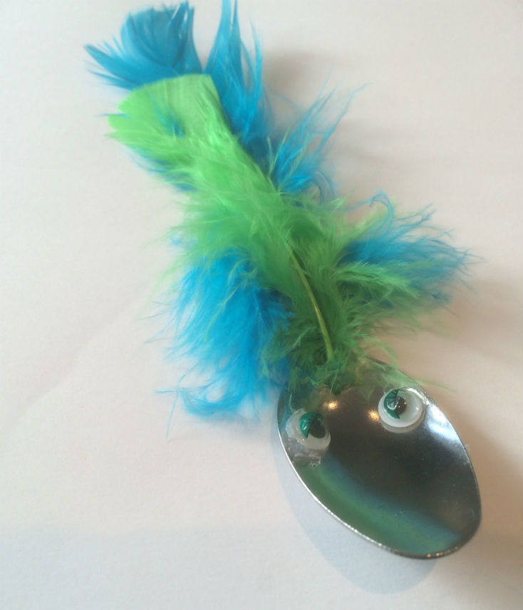
I had prepared some props for Interaction which I forgot to use, so here is my second chance. A teaspoon may look rather plain, but its simple design means that it works. Consider ‘Exhibit A’ below – you may agree with me that it looks better – although you might be influenced by your reaction to the colour pink. So, you could say it looks more attractive, but it still works. Compare and contrast with ‘Exhibit B’ – fundamentally the same, basic teaspoon that has been beautified in such a way to render it pretty much useless. You can take “making something prettier” too far.
Exhibit A
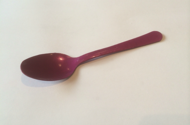
Exhibit B
Beauty can also be in the eye of the beholder and often hard to be objective. In the session I drew comparisons with Beautiful Baby competitions – It’s very hard to be an objective judge and not think that a baby that you are related to is “better” than others – the same could be true for intranet homepages.
So while I would accept that homepages do need to “look nice” it needs to offer something else too.
The E’s
In introducing the session I made a conscious effort to avoid saying “Essential” as that is clearly a characteristic that all homepages should be – a homepage should support and facilitate what someone does – it should act as a work tool.
The E top three;
- Engaging
- Effective/Efficient*
- Easy
* I combined the score for Effective and Efficient as I felt they are interchangeable when it comes to talking homepages (I know that will upset some who are skilled in the art of semantics, but please let us not be pedantic!)
If you though that Engaging and Exciting amounted to pretty much the same thing then you would have been in agreement with 46% of respondents.
Adjectives that are also of note are “Enabling” and “Evolving.” An enabling homepages positions the intranet homepage as being an aid to getting work done, a homepage should be a blend and within that blend should be functionality, not just content. “Evolving” is another key characteristic – the homepage should not be static – it should change as the requirements of the audience it serves changes, and as the objectives of the organisation it exists within changes.
The ‘I’s have it
‘I’ generated the most different options, the top three were;
- Informative
- Interesting
- Innovative
20% of the cards had “Informative” written on them. I think most of us would agree that if your intranet homepage was not rated highly on the metrics of “Informative” and “Interesting” then it would be failing, but this can be as much of how it is presented and how content is written as much as what it presents.
Homepages will retain interest if they are dynamic – there should be some element on it that changes, usually this is some type of news, or communication. If it remains the same for “too long” will soon become wallpaper, and lose any relevance or interest. Often what makes the homepage of interest is the same as that makes it informative. The aspiration here is to make a homepage relevant to its audience, which in some organisations may mean having different homepages for different audiences. It is also important that those who contribute to the homepage, or the content that may be featured within it are aware of how to write and produce content that is appealing and engaging.
The desire to exhibit “Innovation” has close connections with “Original” which was a popular ‘O’ adjective. While there are elements that are common to all good intranet homepages there should be elements that clearly exhibit it as a “bespoke” homepage and not a “mass produced” one.
‘Interactive’ and ‘Intelligent’ were also popular suggestions and there was also some desire to have ‘Idiot Proof’ homepages as well as ‘Inspirational’ ones.
Top ‘O’s
- Organised
- Open
- Original
37% cards had ‘Organised’ on them, if you supplement this with those who said ‘Ordered’, ‘Obvious’ then you have 50%. A good homepage will have a logic behind it – not necessarily one that needs further explanation, but one that presents itself in a ‘useable’ way (See the ‘U’s for more details).
‘Open’ could be interpreted in many ways – it could be that it is the characteristic of an organisation that wishes to break down silos, and have transparency – it could also be a homepage that displays user generated content and shows that it is a platform for peer-to-peer and bottom-up communication and collaboration rather than the traditional, top down communication style of pre-social intranets.
The desire to have originality was also apparent. Interaction featured a “Homepage Wall” where many organisations happily shared their intranet homepages .It was clear to see that there are many common elements but these can be delivered in a way, and style that can demonstrate originality.
I think that it is important to have a homepage that is “Owned” – there should be someone who has responsibility for the homepage – too make sure that it achieves some of the adjectives discussed here as well as considering another key ‘O’ word. How successfully does your intranet homepage help you deliver the intranet objectives? Best practice in intranet governance would be to clearly define what these objectives are, as well as who it is that has responsibility for ensuring homepage effectiveness.
Homepages should also offer something that is “Of the Moment” – again this could be just another way to desire informative and interesting, as well as useful, on which there is more below.
Over to ‘U’s
- Unique
- Understood/Understandable
- Useful
- User friendly
All of these came within 1% point of each other so it is hard to distinguish them. For ‘Unique’ we could read ‘Original.’ A homepage will be ‘User friendly’ if it is Understood and Understandable. A homepage should not need to be explained. If it is then it is not ‘Intuitive’ which is what 12% participants said a homepage should be.
Homepages should be both ‘Useful’ and ‘Usable’ – there is an important distinction to be made here. ‘Useful’ – means someone has a purpose for it – ‘Usable’ means it is designed to be easily (and effectively) used. Exhibit A is useful, Exhibit B is not. Both Exhibit A and B are usable (although not many would choose Exhibit B to stir their tea.) A homepage is useful if it meets the needs of its audience. It is usable if it can be quickly and easily used.
Having a homepage that is “Uniting” or “Unifies” was also suggested – this may be the characteristic of an intranet of an organisation that is going through a period or change, a restructure, a merger or acquisition and there is a clear decision to have one homepage for all – or a homepage that brings people together.
Clearly there is no recipe for a perfect homepage – each homepage will use some of the ingredients that are part of other organisations homepages but the blend is unique to each organisation and needs to be a blend that is harmonious between the needs of the organisation and the expectations and requirements of its users.
Maybe it is time for you to go and ask your colleagues to provide you with their A, E, I, O, U of the intranet homepage that they would like – and ask them to comment on how the one they currently have fits the bill.