The 12 best intranet design hacks you NEED to try
We may not all be designers, artists, or developers: but that’s no reason to leave your intranet design to chance. Here’s our top hacks to breathe life into your internal comms platform – and wow your employees.
Why is it that most corporate platforms are so, well…corporate?
Our digital workplaces are evolving at a rapid rate, introducing new tools at lightning speed. Whether it’s for submitting your expenses, managing your payslips, or accessing your internal IT support desk tickets… there’s an app for that.
But.
While as consumers we now enjoy a far greater user experience that focuses on tailored, easy-to-use and engaging interactions, our workplace tools? Are still lagging far behind.
Progress is being made and there are a few winners getting ahead, but overall, it’s slow. Development continues to be weighted towards the features and functionality side of the scale – the ‘what’ – rather than the design, user experience, or interfaces we interact with.
Intranet Design Guide
In an age where we’re constantly competing for the attention of our employees, a poor performing, or ugly-looking platform is going to make the already tough job of the internal communicator even harder.
So, when it comes to your intranet – how can you ensure it’s hitting the right note? How do you make your corporate intranet visually engaging, without calling for a college degree in programming, art or UI design?
Design: it means more than ‘making stuff look good’
The reason so many organizations fail to invest in design when it comes to their technologies is due to a woeful underestimation of how important it really is.
In our blog, ‘does design matter?’, we highlight the three key elements of design that are required for the success of any digital tool:
- Functional: how it works
- Aesthetic: how it looks
- Experience: how it feels
When a platform is poorly designed and fails to satisfy those three foundational aspects, it’s a recipe for disaster: namely in the shape of poor adoption, lack of engagement, poor user experiences, loss of productivity, inefficiencies and resulting frustration, and ultimately, a loss on your investment.
Design is not just what it looks like and feels like. Design is how it works.
–Steve Jobs
Given the increased expectations of the ‘digital generation’ now entering and growing in our workplaces, it can also have implications for your employer brand and retention rate.
Admittedly as an internal communicator or HR professional, some of those elements of design are going to be outside our field of influence. How a tool or platform works, for example, is going to be mandated by the developers: our only power is to be selective about who we partner and contribute feedback to help shape the roadmap going forward.
But there are a lot of elements we can influence – and should.
Here’s our top simple hacks to transform any flat, dry, text-heavy or boring intranet into a treat for the eyes.
Best intranet design ideas to bring your internal comms to life
#1. Pick your colors
You don’t have to be a global enterprise with a fully defined internal brand strategy to set out a color palette for your intranet. Creating one that you use consistently will make a BIG difference to the aesthetics of your internal comms platform.
Try to stick to using two or three colors: one main color, and one or two second, complementary ones for little pops or accents. These can be bright and bold colors to offset nicely against your wide space – and draw people in!
#2. Love your white space
Never underestimate the power of…nothing.
White space is the designer’s secret weapon: it provides breathing room around your content, so it stands out and the user isn’t overwhelmed. It also provides flow and balance, guides your user to where they want to go, and creates that much-needed canvas or background for the important stuff.
Too often, in a bid to cram in as much information as we can and maximize the use of space, white space is the first thing to go. Trust us: you want to keep it in there. Don’t overload the senses.
3. Beware of busy backgrounds
Off the back of white space, we address the question of backgrounds.
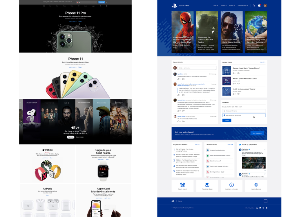
We’re not saying everyone needs to opt for the all-white canvas; but opting for a single solid color that complements your brand palette will allow those other lovely brand colors and bold images to stand out.
Or, you may want to consider using full-width ‘zones’ to break up the background and content into digestible blocks, which will add to the overall experience for users. Consider how Apple takes this approach – which we also see in this fantastic design by Sony Playstation for their intranet:
If you do opt for ‘something more’, keep it subtle. The best intranet platforms use repeated soft patterns or faded images; anything too distracting or ‘noisy’ will pull your users away from the important stuff.
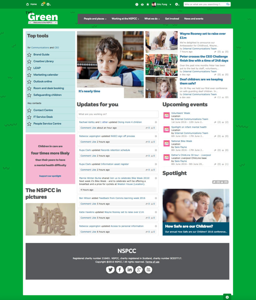
We love this example by the NSPCC, who play on both their brand color and intranet name with just the smallest of repeated detail to give the impression of a grassy village green:
#4. Say goodbye to default or missing images
Nothing is more 1990s or says “amateur” than those fallback ‘missing’ or default images.
Despite our best efforts, we often can’t – or don’t – have control over all comms that go out on our intranets. And as every IC pro will vent, not everyone is meticulous at following best practice or taking the time to add a featured image for their posts, documents, policies, or blogs.
The result is the auto-insert of a placeholder image, which is normally set by your intranet provider and is…well, less than inspiring.
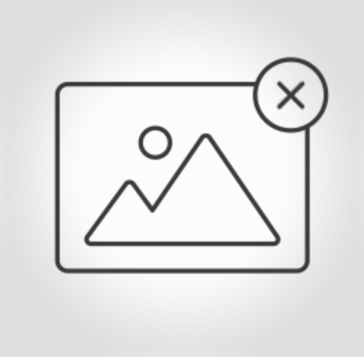
The good news is, that’s normally something you can manually edit, using the admin settings. Experiment with creating your own default icons or images that will plug the gaps left by users when uploading content.
Intranet Design Guide
#5. Get high quality, slick-looking stock images – free
Beautiful, eye-catching images are a must-have for any intranet: particularly as we now appreciate, more than ever, the power of the visual when it comes to communication.
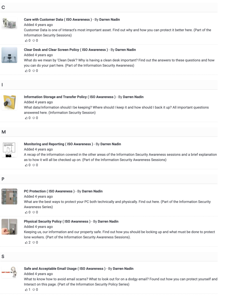
The challenge, for many, is finding the right picture. Although clipart and cartoon graphics ‘retired’ from the mainstream many(!) years ago, they still have a painful tendency to make their way into employee-generated comms – along with the occasional meme or 1990s stock image. Shamefully, that’s the case for our own in-house information security team:
The good news is, you don’t have to plead for a hefty budget or steal from the marketing Shutterstock subscription to step up the look and feel of your intranet.
There are fantastic royalty-free sites with high-end and great looking photography and images, including Unsplash, Pixabay, or Pexels. Make sure they’re not too cheesy, unprofessional, pixelated – and try to look to the ratio/size needed.
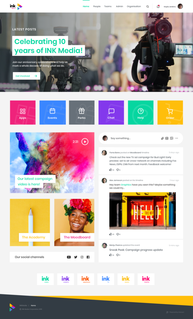
Either point staff to these great resources or consider downloading a bundle of generic fallback images to add to your intranet library for ease. Just check out the difference professional, powerful images can make to your intranet:
Farewell, clipart.
#6. Replace your quick links with a HTML widget or icon (don’t panic – no coding required)
Don’t let a sea of endless text links take over your intranet.
Break up the flow and user journey while making things just a little more aesthetically pleasing with HTML widgets.
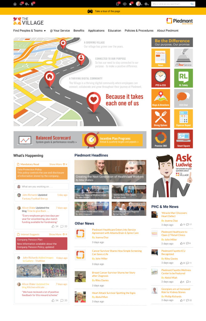
In essence, this means using an image or icon and linking it instead, like our example from Piedmont below:
It normally helps to have a text overlay on the image, to show users exactly what the image is pointing to. If you’re not a pro with Photoshop, don’t panic: there are an abundance of free tools out there, such as Canva, which enable you to upload an image and then place some text of your choice over the top.
Simply add an HTML widget, insert your image, then click on it and ‘add link’ pointing to the destination. Bye-bye, text links.
Intranet Design Guide
#7. Mix it up
In case the previous points haven’t hammered this home yet, we’re going to spell it out: mix up your content where possible.
Got a policy to upload? Add an image or banner header to break it up. Writing up an event? Stick in a gallery, a video. A good balance of text-centric and image-centric areas helps break things up for the user and retains their attention, drawing them into – and further down – the page.
Thanks to the wonder that is The Internet – and your wider digital workplace – there are also a whole host of free HTML widgets and additions you can add to pages for a touch of variety or interest.
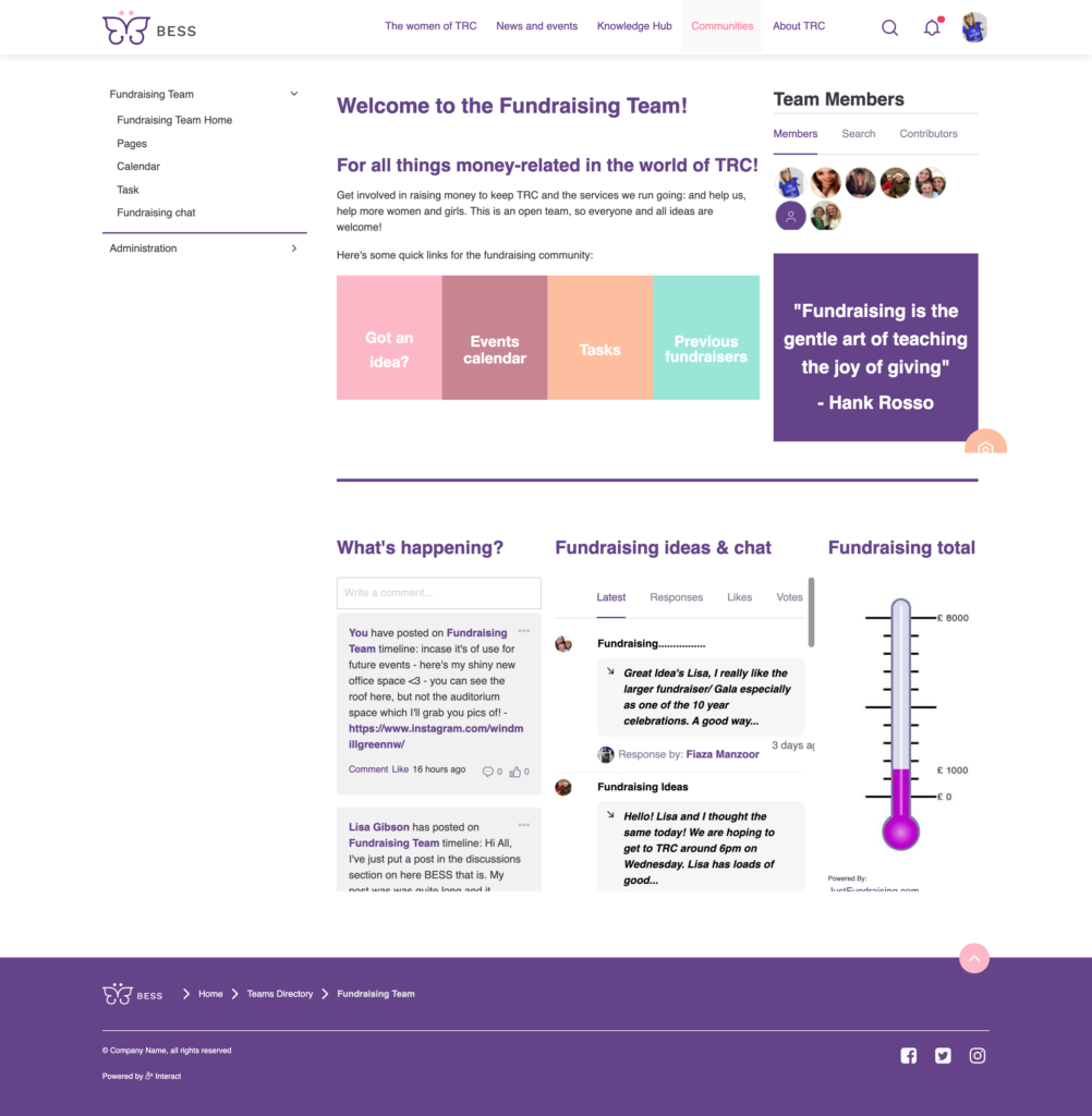
For example; the latest stocks, your sales or PowerBi dashboard, your ZenDesk tickets, your Slack channel, tickers, countdown clocks, and more. Here, a Fundraising team features a simple widget to show where the team is up to against the fundraising target:
#8. Decide what to focus on
We’re going to backpedal a bit; although mixing it up and introducing new elements to your intranet pages is a great way to break up content and grab the attention of your users, don’t do so at the cost of the purpose of the page.
What is the reason the user is visiting this page? What action do you want them to take? Which information is the most important?
For example, on your homepage you may want to give priority to ‘latest news’, or perhaps this is just an entry point and you want to guide your users through your site with easy quicklinks. If it’s your ‘About Us’ page, it may be a big image, your mission statement and values, or a brief overview of your history.
Define the purpose of the page and then use design to make the important bits ‘pop’. Give those ‘hero’ elements more space, make them full-width or place them at the top. Use headers to indicate hierarchy – H1 for most important, H2 for the next, and so on.
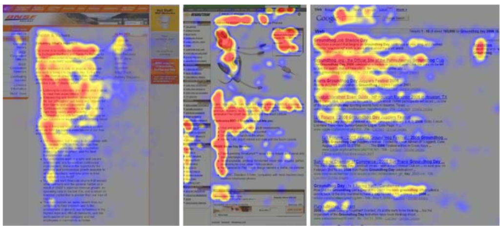
Remember user behavior for digesting content: the infamous ‘F’ shape is the most common, going left-to-right, down, and then left-to-right again, as these heatmaps indicate:
Don’t overwhelm your pages. Think about where your content and information needs to go; and before adding anything, ask the simple question: ‘is this needed?’.
#9. Make images responsive
In today’s mobile-first digital workplace, presenting staff with images that are either microscopically small on mobile, or amplified but cutting off halfway, isn’t going to fly.
If your CMS doesn’t already have wizardry built-in, ensure your images are responsive with a simple design hack.
When adding any image to a content page, blog, forum or otherwise, simply take 10 seconds to view and edit the image attributes. Replace the fixed width with ‘100%’ (or whatever width you’d like it to be of the overall page) and delete the height. Your image will auto-resize depending on the size of the screen. Simple!
#10. Use tables
Need information or pictures presented in a more structured format, but struggling with the limitations of your CMS? Never fear. A basic table is a priceless tool for keeping things tidy – and your users need never know if you simply remove the border and lines.
Let’s take this page for example. We want to display 6 images in 3 rows, but aligning with text isn’t doing the job.
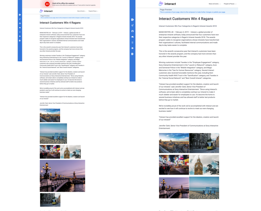
Inserting a table and inserting an image in each cell, while making the border ‘0’ so it becomes invisible, will keep everything neat and tidy. For a super hack, set the size for each column the same to display everything in neat proportions. It’s easier on the eye and makes for a better experience for users.
#11. Make typography consistent – and readable
Similarly to colors, try to only use one or two different fonts to avoid an eyesore mish-mash.
A web-safe font is best, and sans-serif fonts (such as Arial, Helvetica, Roboto) tend to look cleaner and more modern than serif fonts (i.e., Georgia, Times New Roman).
Not got a company font as part of your brand? No problem. Google Fonts is a great free resource: download your fonts and assign to your intranet theme.
#12. Put Accessibility top of the agenda
Think about the legibility of your content.
An intranet is designed to connect people, information, and tools: don’t be leaving members of your staff out to loop due to an inability to access the hub of their digital workplace.
Don’t use a light grey font on a white background, for example; be aware of accessibility needs such as color blindness or vision impairments. Your font should be readable and a decent size (15px or 16px is a recommended minimum) and a regular weight, not ‘thin’ or ‘ultra thin’.
Check with your intranet provider for their accessibility credentials: Interact offer Accessibility Themes, which include high-contrast themes users can toggle on if they have difficulty with the standard one.